
Timeless Home Color Schemes: How to Choose Colors That Never Go Out of Style
Every decade has its signature colors. One year, warm neutrals dominate interior design; a few years later, deep greens, earthy browns, or bold blues take center stage. Trends can be exciting, but they also change quickly. The colors that feel fresh today may look dated sooner than you expect.
A timeless home color scheme takes a different approach. Instead of building an entire room around the latest trend, it combines a versatile foundation with colors that reflect your personality. The result is a home that feels cohesive, comfortable, and easy to update as your tastes evolve.
Whether you’re planning a full remodel or simply refreshing a few rooms, choosing your colors carefully can help you create a look that lasts well beyond the current design cycle.
Start With a Calm, Versatile Base
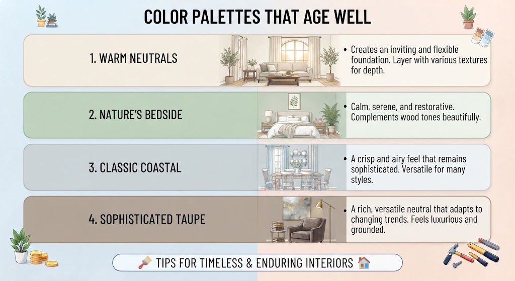
A timeless color palette often begins with understated shades that work well with different materials, furniture styles, and decorative accents.
Warm whites, soft creams, gentle grays, beige, and sandy neutrals provide a flexible backdrop for almost any interior. These colors can make a room feel bright and welcoming without demanding too much attention.
The right neutral also helps other elements stand out. Wood furniture, textured fabrics, artwork, and decorative objects can add personality without making the overall design feel busy.
However, neutral doesn’t have to mean plain. A warm white can feel very different from a cool white, while beige with subtle earthy undertones creates a different atmosphere from a crisp gray.
Think about the mood you want to create. Warm neutrals tend to feel inviting and relaxed, while cooler shades can create a cleaner, more contemporary appearance. Choose a direction that suits your home rather than selecting a color simply because it is popular.
Take Inspiration From Nature
Natural colors have a lasting appeal because they connect interior spaces with the world outside. Rather than relying on a particular trend, they draw from landscapes, plants, water, stone, and natural materials.
Consider incorporating shades such as:
-
Leafy greens: Sage, olive, and muted forest green can create a calm, grounded atmosphere.
-
Earthy reds and browns: Clay, terracotta, and warm rust add depth and character.
-
Blues inspired by the sky and water: Soft blue, slate blue, and deeper ocean tones can make a room feel restful.
-
Stone and sand: Taupe, warm gray, and sandy beige provide understated warmth.
-
Natural wood tones: Oak, walnut, and other wood finishes bring texture and visual richness.
These colors work particularly well alongside natural materials such as wood, stone, linen, and woven fibers. Together, they create a layered look that feels considered rather than overly coordinated.
You don’t need to use all these shades in one room. Choose one or two that complement your neutral foundation and repeat them in different ways throughout the home.
Keep Expensive, Permanent Surfaces Relatively Timeless
Some design decisions are easy to change. Others require considerable time, money, and disruption to replace.
Paint can be refreshed over a weekend, and cushions or curtains can be swapped whenever you want a new look. Flooring, countertops, cabinetry, and extensive tile installations are much more expensive commitments.
For this reason, it often makes sense to choose versatile colors for large, permanent surfaces. Classic wood flooring, understated countertops, and tile in adaptable shades can provide a foundation for many different decorating styles.
This doesn’t mean every kitchen or bathroom needs white cabinets and neutral tile. A deep green vanity or richly colored backsplash can look beautiful when chosen thoughtfully. The important thing is to consider how the color will work with the rest of the space and whether you’ll still enjoy it in several years.
If you’re drawn to a bold trend, try introducing it through an element that is easier to update before committing to an expensive installation.
Express Your Personality Through Smaller Details
A timeless interior doesn’t need to be colorless. In fact, a neutral foundation can make personal touches more effective.
Smaller decorative elements give you the freedom to experiment with new colors without redesigning an entire room.
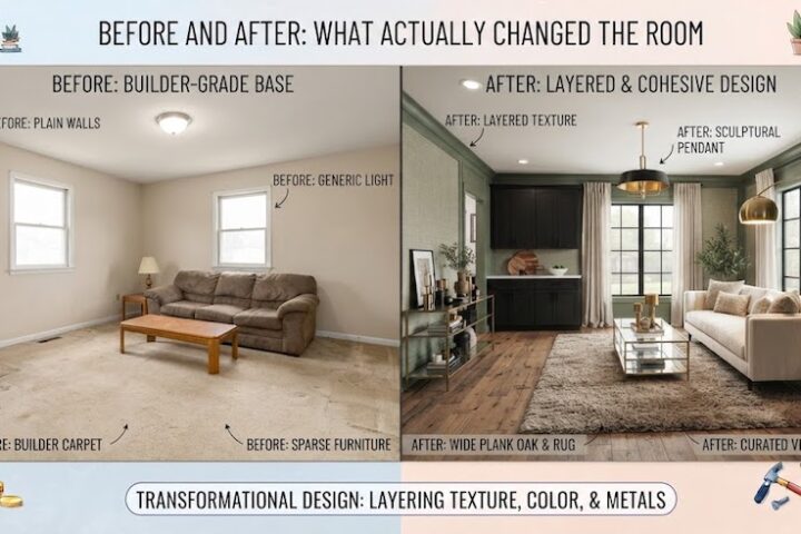
Paint is one of the easiest ways to introduce a stronger shade. An accent wall, a painted piece of furniture, or a refreshed interior door can change the character of a space without requiring a major investment.
Textiles offer another flexible option. Cushions, throws, curtains, and bedding can introduce seasonal colors or patterns, and they are relatively easy to replace when your preferences change.
Artwork and accessories let you reflect your interests and personality. A colorful painting, an interesting ceramic piece, or a collection of objects can give a room character without dictating every other design choice.
Plants and flowers provide living color and natural variation. Their greens can complement a wide range of palettes, while seasonal flowers offer an easy way to introduce brighter shades.
The advantage of this approach is flexibility. Your home can evolve with your taste without requiring you to replace its most expensive features.
Create a Color Flow Throughout Your Home
A home feels more harmonious when the colors in one room relate naturally to those in the next. This doesn’t mean every room should look identical. Instead, aim for a consistent visual thread that connects the spaces.
One simple method is to choose three or four colors for the overall home palette. You might begin with a warm neutral, add a natural green, introduce a muted blue, and use a deeper brown as an accent.
Each room can use these colors in different proportions. The living room might feature neutral walls and green cushions, while a bedroom uses the same green more subtly alongside cream bedding. A hallway could incorporate the neutral foundation with artwork that repeats the blue.
Repeating colors in this way creates continuity without making the home feel repetitive.
Pay attention to how rooms connect visually, particularly when doorways remain open or several spaces share a sightline. Colors that work beautifully in isolation may feel disconnected when viewed together.
Before finalizing your palette, consider the home as a whole rather than choosing every room independently.
Remember That Lighting Changes Everything
A paint color rarely looks exactly the same in every room. Natural light, artificial lighting, window direction, and surrounding finishes all influence how a shade appears.
A warm beige may look soft and inviting in a sunny living room but appear darker in a room with limited daylight. A gray that looks neutral in the store may reveal blue or green undertones once it is on the wall.
Before committing to a color, test samples directly in the room where you plan to use them. Observe them in the morning, afternoon, and evening, and check how they look under your usual light fixtures.
It’s also worth considering the finishes and materials nearby. Flooring, countertops, furniture, and window treatments can affect how you perceive a wall color.
A little testing can prevent an expensive disappointment and help you choose a shade that works under your home’s actual conditions.
Balance Trends With Lasting Style
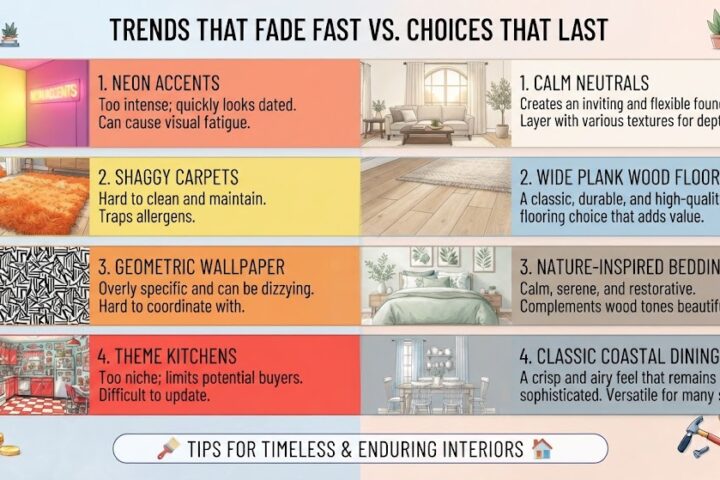
Following design trends can be enjoyable. A fashionable color might introduce an energy or atmosphere you genuinely love, and there is no reason to avoid it simply because it is currently popular.
The challenge is knowing where to use it.
If a trendy shade appeals to you, consider introducing it through paint, accessories, artwork, or textiles. These elements can be updated more easily if your taste changes.
For expensive or permanent features, think about whether the color complements the home’s architecture, materials, and overall character. A trend can still be a good long-term choice when it genuinely suits the space.
Ultimately, timeless design isn’t about avoiding change. It is about making choices that give you flexibility, preserve visual harmony, and reflect your preferences rather than following every new fashion.
Choose Colors That Feel Right to You
There is no universal color palette that works for every home. Architecture, natural light, furniture, and personal preferences all influence what looks and feels right.
Start with a versatile foundation, bring in inspiration from nature, and introduce personality through carefully chosen accents. Consider how the rooms connect, test colors under different lighting conditions, and give yourself time to decide before committing to major changes.
Most importantly, choose colors you enjoy living with. A home should reflect the people who use it, not simply reproduce the latest photographs from a design magazine.
When your palette combines practical choices with personal expression, it can remain appealing long after today’s trends have passed.
For more ideas on balancing current styles with lasting design, explore our guide to trends that fade fast versus choices that last.

Comments
0 commentsNo comments yet. Be the first to share your experience.